BRANDING GUIDeLINEs
Below are the building blocks for Diana Lake Lodge brand. While this infographic is here
to get you started, all uses need to be approved by Diana Lake Lodge.
The DIANA LAKE LODGE logo
Full-color Logo
DAY
NIGHT
GRAYSCALE
Monochrome Logo

BLACK

WHITE
Using the DIANA LAKE LODGE logo
Safe space
The Diana Lake logo always needs safe space that is free of imagery
and text surrounding it. Use the word LAKE width to determine the
minimum amount of safe space that should surround the Logo.
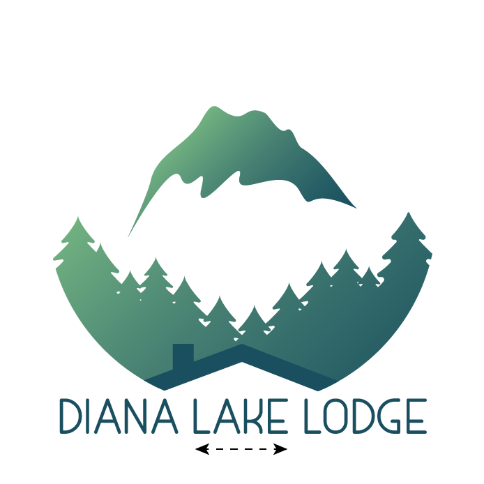
Safe space
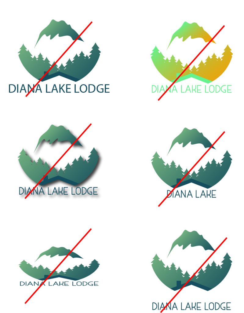
The Diana Lake Lodge logo is a symbol people recognize, so it should never be altered.
Here are a few examples of what not to do with the Diana Lake Lodge logo.
Don’t
- Change the spacing between the icon and the word “Diana Lake
Lodge” or its letters - Choose a different typeface for “Diana Lake Lodge”
- Add visual effects like a drop shadow
- Change or replace the word “Diana Lake Lodge” in any way
- Change the shape of the logo
- Use the Logo in a phrase or sentence
Using the logo on solid backgrounds


Using the logo over an image or a video
If a background color makes the full-color Logo hard to see, you should use a monochrome Logo instead.
The black monochrome and white monochrome has a no-fill roof shape.

